Using what I learnt reading Interaction of Color, I tried out some of the exercises myself. Below are images of the colour combinations I tried out.
 |
| In this experiment, the smaller orange squares are the same colour, but due to the colours that surround them and the colours they lie on top of, they appear different. I tried a few different colour combinations myself to replicate this effect, I also tried staying within the same hue and just changing saturation and light. |
 |
| This experiment is about the subtraction of colour, I used two colours with hue near each other on the colour wheel, using a grey background behind one and a dark background of another colour behind the other. When staring in the middle of these it makes the colours look the same or very similar when they are quite different. |
 |
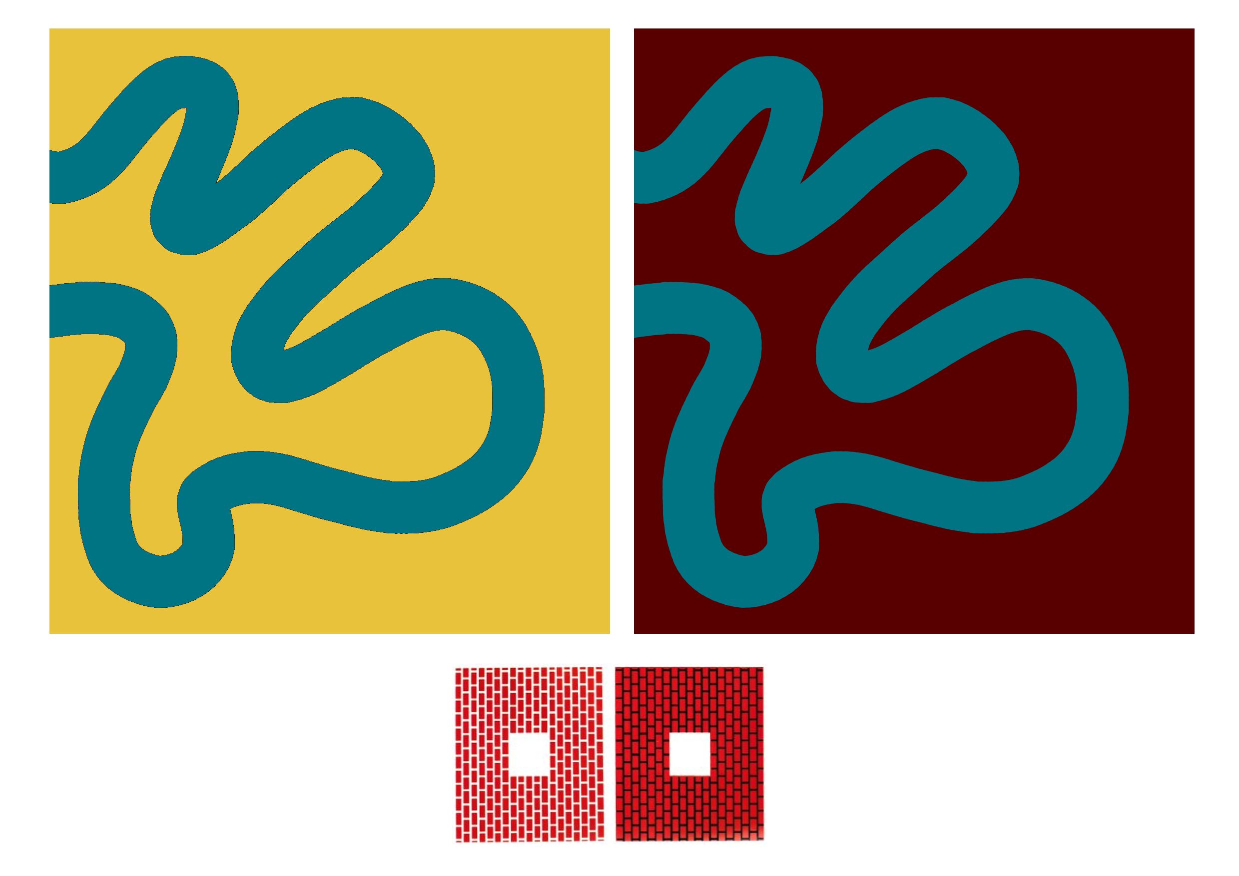
| In this experiment I wanted to see how a pattern could look different if only the background colour was changed. Making one background a dark red, and the other a light yellow, it makes the composition look very different - both give off a different feel. |


.PNG)
Comments
Post a Comment