Reflecting on Areas to Improve
Before looking at setting my next brief, I looked at other work created by concept artists to see what I could improve on going forwards. I wanted to look at how other artists render their concept art, areas I could save time on and how they present their work in their portfolios.


Artist: Ilya Golitsyn


Ilya’s work here demonstrates that rendering the back of a character lots isn’t always necessary, here Ilya put detail into showing how the material of the skirt works at the front, but doesn’t repeat this on the back view as we already have been shown how it would look.
Similarly with the character above this, the material doesn’t need to be rendered the same way as it would just waste time, we already know what it would look like based on the front view. Ilya does detail the metal slabs hanging down from the shoulder, and around the waist, but again it is still quite minimal rendering compared to the front.
The work is displayed in the portfolio on a plain white background which makes the concepts really stand out.
Artist: Jong Min Li


Jong Min again also displays these concepts over a plain white background, making them stand out and ensuring the background doesn’t distract from the concepts themselves.
Similar to Ilya’s work above, it seems Jong Min didn’t do a side view as it wont have been needed, but they do provide a side view of the hair plume with a sketch as understanding how this is shaped would be important information for a 3D artist.
The back view of the character is quite similar in rendering to the front view, but when looking at materials like the metal of the plates hanging at the hip, these seem to have less detail in the back view. As the characters swords and hat are not fully viewable, rather than redrawing the character again entirely from a side and a top down view, Jong Min simply puts some sketches of what these items look like next to the character.
Artist: Jane Katsubo


Here Jane is displaying outfit types, she uses a grey background with a green tint on the lower options and a blue tint on the top. This hint of colour helps to make the concepts look better with the background, whereas plain grey might have washed out the designs a bit.
The initial ideas she presents do not have a back view, as this would take up time she could spend on different concepts. It’s likely after getting the opinion of the Art Director she would take the final design and then have done the back of it, which seems to be the image above.
In the centre of the final design sheet, she includes small images of materials or plants used in the outfit. There also is no side view once again, and the back view is less detailed in rendering than the front.
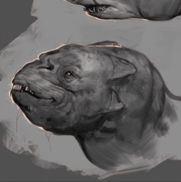
Artist: Jørunn Agnes


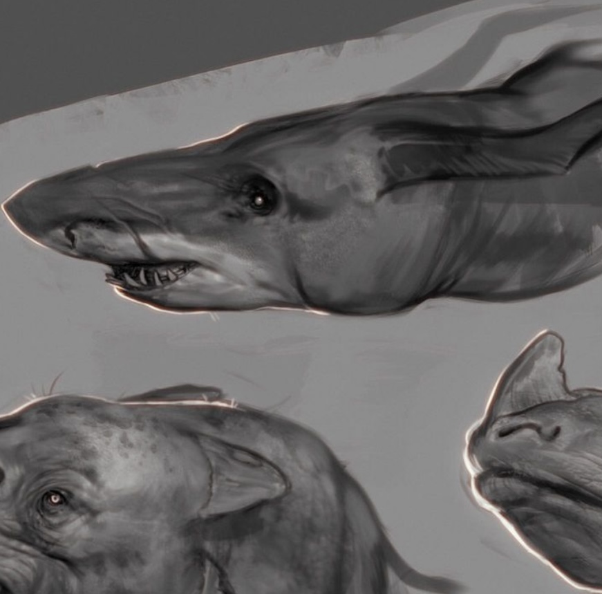
Jørunn is currently working on a project so is unable to post her latest concept art, but just looking at her creature concepts here is really helpful. For these initial ideas she just shows a side view of each of the concepts (for creature design, this seems to be more important than a front view typically).
The background of the sheet is a dark grey, with a lighter grey over the top, painted in a way to add a bit more texture and interest to the background.
Summary
I have made some bullet point of the key points I will be taking into the next brief;
- Try to avoid a plain grey background as this could wash out my concepts, it seems most artists will either add a hint of texture, a tinted grey or a plain white background. This way the concepts stand out more.
- A side view might not be necessary, do the front and back view of the character and if there are elements that need a side view consider drawing them separately on the side.
- When rendering, don’t duplicate detailed rendering on the back view of the character if it is already made clear in the front view of that character how the back would look.
- If a material uses a specific pattern or references a material in real life, it can be more efficient to include small images referencing these materials rather than rendering them.
I will be baring in mind what I have learnt in this reflection for my next concept, hopefully I can make some improvements.


.PNG)
Comments
Post a Comment